This article really appealed to me. It's good to know that someone is on the same page with this as I am. In fact, I'll go ahead and apologize now for the ranting and raving that I may follow into in the upcoming sentences.
For the past three months I've been employed with Trader Publishing Company. We design and publish Auto Mart magazine. I would wager that the company I work for is probably one of the lead contributors in this offensive business of type distortion. I want to wretch everyday I go to work and see the phrase "make this word as big as you possibly can" in the header of a spec sheet. Without going into too much detail, the magazine I help edit and publish is the kind of BS design that you would bring into an introductory graphic design class as an example of what one would gather "bad design" might be.
To help you understand my job as a "designer" within this company I will tell you that sadly, they allow the dealerships' sales representatives to dictate the style, illustrations, photos, and (ta-da) TYPOGRAPHY of each advertisement within the magazine. As the "graphic artist" here, I have been given (literally) ZERO creative freedoms while the ignorant entry-level, soccer mom sales reps instruct me to squeeze 8 lines of 6pt. font, at 6pt leading in a 1/2" box. YEAH, right. These people aren't concerned with the beauty of a letterform, rather what all they can fit in the smallest amount of space. but WHY?! This concept is totally foreign to me; I'd like to hear the argument that their sales actually increase if they stick with this idea. So I'm sure you can imagine what goes through my mind as I pick up an ad to edit and see instructions to distort and transform the beautiful letterforms I have come to know and love, into some monstrosity of crap. For lack of a better example, the final product often reminds me of my little brother's brontosaurus drawings. Except the drawings are much more entertaining.
People have taken their "creative liberties" to an abusive level. As I was reading this article I couldn't help but wonder if there was a way of putting legal restrictions or limitations on the proportional aspects of typefaces, alright silly I know. I realize that is ridiculous but does anyone have a better solution? I would even try the whole "knowing is half the battle" stance, but it's way too obvious to me that there's no way to educate these people properly. They're trained to shove characters, not use their forms to benefit the ads. P.S. people at work are admittedly afraid of the moment I snap because I get so fed up. I'm sorry, but expanding a letter to 125% horizontally just to accommodate a fool isn't a great way to start off the day. Yikes!
My theory: there's a small war going on and although designers/typographers are struggling to keep the delicacies of our alphabetic characters intact, there is also a portion of the culture whom (through pure ignorance) neglect and destroy that certain sensitivity other try so hard to achieve... oh, in the name of advertising?!
It's our job to help these folks understand what they're doing. We're supposed to charge ourselves with that responsibility as designers. The good news is that there does seem to be an integration between design and the American advertising culture happening more now than ever, amen. BUT, if someone is willing to listen to my ideas, I know I have to take it upon myself to show them the best way to use, not only type but also image, color, etc.
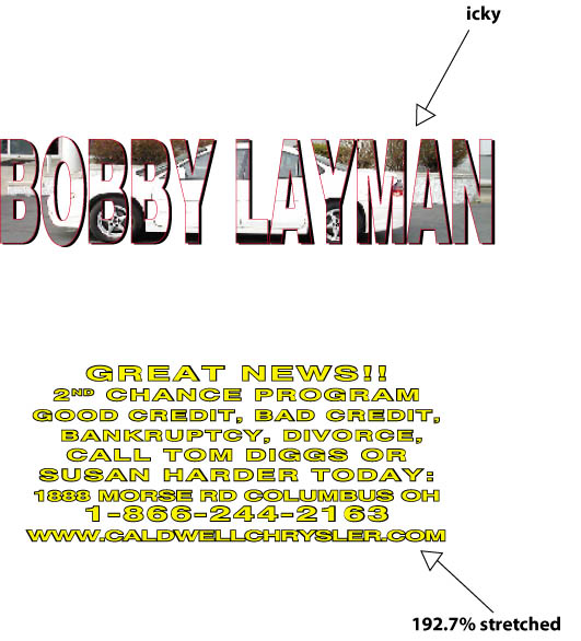
•Here's some examples, I worked on these Friday... and cried.. :O)

For the past three months I've been employed with Trader Publishing Company. We design and publish Auto Mart magazine. I would wager that the company I work for is probably one of the lead contributors in this offensive business of type distortion. I want to wretch everyday I go to work and see the phrase "make this word as big as you possibly can" in the header of a spec sheet. Without going into too much detail, the magazine I help edit and publish is the kind of BS design that you would bring into an introductory graphic design class as an example of what one would gather "bad design" might be.
To help you understand my job as a "designer" within this company I will tell you that sadly, they allow the dealerships' sales representatives to dictate the style, illustrations, photos, and (ta-da) TYPOGRAPHY of each advertisement within the magazine. As the "graphic artist" here, I have been given (literally) ZERO creative freedoms while the ignorant entry-level, soccer mom sales reps instruct me to squeeze 8 lines of 6pt. font, at 6pt leading in a 1/2" box. YEAH, right. These people aren't concerned with the beauty of a letterform, rather what all they can fit in the smallest amount of space. but WHY?! This concept is totally foreign to me; I'd like to hear the argument that their sales actually increase if they stick with this idea. So I'm sure you can imagine what goes through my mind as I pick up an ad to edit and see instructions to distort and transform the beautiful letterforms I have come to know and love, into some monstrosity of crap. For lack of a better example, the final product often reminds me of my little brother's brontosaurus drawings. Except the drawings are much more entertaining.
People have taken their "creative liberties" to an abusive level. As I was reading this article I couldn't help but wonder if there was a way of putting legal restrictions or limitations on the proportional aspects of typefaces, alright silly I know. I realize that is ridiculous but does anyone have a better solution? I would even try the whole "knowing is half the battle" stance, but it's way too obvious to me that there's no way to educate these people properly. They're trained to shove characters, not use their forms to benefit the ads. P.S. people at work are admittedly afraid of the moment I snap because I get so fed up. I'm sorry, but expanding a letter to 125% horizontally just to accommodate a fool isn't a great way to start off the day. Yikes!

My theory: there's a small war going on and although designers/typographers are struggling to keep the delicacies of our alphabetic characters intact, there is also a portion of the culture whom (through pure ignorance) neglect and destroy that certain sensitivity other try so hard to achieve... oh, in the name of advertising?!
It's our job to help these folks understand what they're doing. We're supposed to charge ourselves with that responsibility as designers. The good news is that there does seem to be an integration between design and the American advertising culture happening more now than ever, amen. BUT, if someone is willing to listen to my ideas, I know I have to take it upon myself to show them the best way to use, not only type but also image, color, etc.
•Here's some examples, I worked on these Friday... and cried.. :O)
posted by alissa at 7:53 PM
![]()

0 Comments:
Post a Comment
<< Home