Saturday, September 30, 2006

it seems only appropriate that i write this blog in all lowercase. why shouldn't i? i do it all the time. in emails. in messages. etc. perhaps my lackadaisical generation is saying goodbye to proper grammar and hello to a new style of quick conversation. maybe laziness is to blame: our fast-paced lifestyles are making us foget entirely about the shift button. but is it that hard to capitalize?

the only place that you truly see this new typographic/grammatical phenomena (besides through internet communication) is in logos. macys. adidas. apple. and nike (who now features a more contemporary all lowercase logo, much unlike its older logo: NIKE). i even saw a flashy new corvette with its name in all lowercase. i was pretty impressed. lowercase logos are more inviting and less threatening. when you put something, such as a logo, in all caps it changes the meaning entirely. it becomes more "corporate" or official. such as: WAL MART. case closed.

but what if we started writing in all lowercase and completely ditched our shift button? lets just imagine a keyboard sans the shift button. how odd. what if you picked up a book and started to read it only to find no capital letters in sight. no names capitalized. no beginnings of sentences capitalized. no titles capitalized. it'd be grammatical chaos. we are so used to reading sentences with a combination of upper and lower case that if we took away uppercase, we'd be confused. we'd be confused because something just wouldn't feel right. our eyes are trained to read the combination of upper and lower case letterforms together. so why change that now?

now imagine what it might be like to read certain words, usually capitalized, that are now in all lowercase. look at the following words:

jesus
george w. bush
fbi
cia
united states of america
kentucky
aol
aids
and so on
and so on

these words look different to me. and placed within the context of a sentence, you might really be confused. some words need to be differentiated from other words or else their meanings are depreciated. now look at the following sentence:

jesus was on aol last friday night while the fbi tapped into his blog account.


(odd.)


if we were to write in all lowercase for convenience purposes then what comes next? no paragraphs too? no page numbers? all of these things are heavily considered in terms of books, magazines, periodicals, etc. together they make a cohesive system for reading. we can not rid ourselves of using uppercase, our minds are too accustomed to their presence.

The Cult of Lower Case
By.Douglas C. McMurtrie

Letters either upper case or lower are beautiful. It is difficult for me to imagine not using capitals in my everyday life. They are part of our culture and how we do things. The article says that “capitals only hold their jobs through influence of tradition.” We are used to them. The question is rather could we do without them. After years of training our eye to get used to the idea of not having capitals, I would guess it would become normal like when anything is changed in our lives. No one liked the idea of cell phones or computers and we all got used to them. Now I am not saying that changing the way we write and use letters is the same thing. And I do not agree with getting rid of capitals. I do feel that they have a special place in the world, and they do there job.
“Do they or do they not contribute to our ease of reading and comprehending what we read.” Here is a great question. I think that they do. The use of the capital helps us to clearly read. Yes, there are the typical beginning of a sentence and when you are spelling a name, or place. But does anyone think about the capitals we see other than that. On a stop sign, when someone is trying to get our attention. These are ways we use type to reach people. If we saw stop, instead of STOP, we may see it as less important. Yes, “ with ascenders and decenders the small letters have more numerous points of differentiation in thier form than do capitals.” And as designers we use this to our advantage. We can run words off a page and still know what letter it is. This isn’t as simple with capitals. They may not stand on their own when they are only partially shown. They tend to look like other letters. Like the Base of a F, T,or an R, H, or A. because of the way that the legs are set, if you cut off the top you loose the letter. If I see something written in all lower case I get the feeling that it is soft, and nice. When they are in all caps they say that they are important and need to stand out. I think using the two together make our language what it is, and who we are. Just like the way someone speaks, the way that we use type is unique to us.
This article brought to my attention the fact that only the “white” races use capitals. And I think that it is amazing. There are so many languages and ways of writing. To us it is strange that you would not use capitals. But other countries do and it works for them. But like the book says, Germany uses capitals more than anyone else. So getting rid of using capitals would not work for them at all. I think that some cultures can do this, but other can not. I don’t feel that this is a good thing. I like my capitals, I like using them with lower case. Should it only be one or the other, no. They both play to big a role in our culture and society. We need them, we are used to them. They are guides, history, and the future of type. Without one, words would loose all meaning that they once had. And words are powerful.

Sunday, September 10, 2006

I guess it’s inevitable... the “obscene typography machine” was bound to rear its ugly head sooner or later. With the ever growing advancement of technology there is bound to be a loss of craft. Remember the industrial revolution in graphic design? New materials were readily available at the fingertips of designers thus creating new possibilities in production. Steel, iron, and steam powered energy created new possibilities. The first ever letter presses were utilized and enabled quicker typographic reproduction. This era of technological advancement brought with it a boom of mass communication. And indirectly, a loss of craft and appreciation for typography and design.

They say that history repeats itself. You’ve heard it a hundred times. It’s corny, I know. But somewhat true. Are we repeating the industrial revolution in graphic design at this moment? Think of it this way: during the industrial revolution there were many new advancements, i.e. steel and iron. These two very important natural materials aided so much in typographic reproduction. Now fast forward about 200 years later and what do you have? the computer. PLAH. I’m starting to dread the medium as a graphic design student. But as a student in this new era of graphic design, the “deconstructivist typography” era if you will, this is probably the main outlet for design. And when used intelligently and thoughtfully, it can be used to create beautiful and highly aesthetic works in graphic design.

But what about all those other people? those people that you might see in Borders or Barnes & Noble latched on to a book with some crazy title like, “Typography for Dummies.” these are the people we designers need to steer clear of. Or better yet, maybe we should be the ones trying to educate them about the proper uses and functions of type. Yes, it is our duty as designers and lovers of the medium to tell Susie do-it-herself about the unwritten “rules” that surround typography. If not for our eyes sake, lets try to do for the sake of Frederic W. Goudy and John Baskerville (as they do somersaults in their graves).

It was only inevitable that the fate of the Industrial Revolution was a loss of craft. Mass production caused an overbearing boom in visual communication. This lead to an apathetic view of design thus creating a disinterest in the medium itself. But with the emergence of figures such as John Ruskin, society started to realize that industrialization and technology had created a separation between artist and visual medium. Thus the arts and crafts movement was born. There was a revival of handicraft and thoutfulness that went into creating not only design, but furniture design, and book design as well. And perhaps with perfect timing, figures like Goudy emerged from this movement.

They say that history repeats itself. Well, then aren’t we about due for another type of arts and crafts movement? I hope so. I am beginning to think that design/typography is heading for a very ugly place. A place where ANYONE can create design. And as we all know, not everyone can be a designer. It takes a special type of person. A person with vision. A person with visual sensitivity. NOT Susie do-it-herslf.

Saturday, September 09, 2006

This article really appealed to me. It's good to know that someone is on the same page with this as I am. In fact, I'll go ahead and apologize now for the ranting and raving that I may follow into in the upcoming sentences.

For the past three months I've been employed with Trader Publishing Company. We design and publish Auto Mart magazine. I would wager that the company I work for is probably one of the lead contributors in this offensive business of type distortion. I want to wretch everyday I go to work and see the phrase "make this word as big as you possibly can" in the header of a spec sheet. Without going into too much detail, the magazine I help edit and publish is the kind of BS design that you would bring into an introductory graphic design class as an example of what one would gather "bad design" might be.

To help you understand my job as a "designer" within this company I will tell you that sadly, they allow the dealerships' sales representatives to dictate the style, illustrations, photos, and (ta-da) TYPOGRAPHY of each advertisement within the magazine. As the "graphic artist" here, I have been given (literally) ZERO creative freedoms while the ignorant entry-level, soccer mom sales reps instruct me to squeeze 8 lines of 6pt. font, at 6pt leading in a 1/2" box. YEAH, right. These people aren't concerned with the beauty of a letterform, rather what all they can fit in the smallest amount of space. but WHY?! This concept is totally foreign to me; I'd like to hear the argument that their sales actually increase if they stick with this idea. So I'm sure you can imagine what goes through my mind as I pick up an ad to edit and see instructions to distort and transform the beautiful letterforms I have come to know and love, into some monstrosity of crap. For lack of a better example, the final product often reminds me of my little brother's brontosaurus drawings. Except the drawings are much more entertaining.

People have taken their "creative liberties" to an abusive level. As I was reading this article I couldn't help but wonder if there was a way of putting legal restrictions or limitations on the proportional aspects of typefaces, alright silly I know. I realize that is ridiculous but does anyone have a better solution? I would even try the whole "knowing is half the battle" stance, but it's way too obvious to me that there's no way to educate these people properly. They're trained to shove characters, not use their forms to benefit the ads. P.S. people at work are admittedly afraid of the moment I snap because I get so fed up. I'm sorry, but expanding a letter to 125% horizontally just to accommodate a fool isn't a great way to start off the day. Yikes!


My theory: there's a small war going on and although designers/typographers are struggling to keep the delicacies of our alphabetic characters intact, there is also a portion of the culture whom (through pure ignorance) neglect and destroy that certain sensitivity other try so hard to achieve... oh, in the name of advertising?!

It's our job to help these folks understand what they're doing. We're supposed to charge ourselves with that responsibility as designers. The good news is that there does seem to be an integration between design and the American advertising culture happening more now than ever, amen. BUT, if someone is willing to listen to my ideas, I know I have to take it upon myself to show them the best way to use, not only type but also image, color, etc.

•Here's some examples, I worked on these Friday... and cried.. :O)
To be a graphic designer you need to know how to draw, paint, and use the computer. We are in school to learn these things, and how to use them together to design. We learn how to look at type, and to appreciate it for more than just a letter. We see it as more. We know the difference between good and bad type. The difference between an ear, tail, what x height is, or what the base line is. But sadly as the author has said any old person who knows how to go online can buy the program to make their own type. So what makes up a piece of type means nothing to them. This is a sad fact to me. You don’t have to be trained to understand, or even learn what makes one type different from another. It wouldn’t surprise me if someone with these programs didn’t know the difference between garamond and comic sans. I have respect for creators of both. But comic sans is not a font that is good in anyway, except in very few circumstances. Buying a type program is like someone saying, “I’m going into graphic design because I like to use the computer, but I don’t like art.” You need to know the different principles and forms of art to be a designer. Just like you need to study type to create it. Just because you have a program that designs type does not mean you are a typographer, or just because you have a stethoscope doesn’t make you a doctor. All these programs are here for, is to make money. Who cares if it, as the author says “Goudy and Baskerville must be spinning in their graves.” As a sign of respect to our fathers in type, type should be respected. Not just thrown off to anyone who can use a computer. As I see it, these programs are a slap in the face to all designers, not just the ones of the past.

Group A

Tuesday, September 05, 2006

NKU Fall 2006 Advanced Typography Students…


Hello NKU Advanced Type Students! Your first post to this blog is due by Sunday, September 10th at 12:00 noon. Please be timely in posting your essay response. Try to respond somewhere in the area of 300-600 words with your well-written opinions/personal experiences as they relate to the topics covered in the assigned essay.

If you are in group “A”, you are to read and respond to:
The Obscene Typography Machine, By Philip Meggs (pp 36–38)

If you are in group “B”, you are to read and respond to:
Designing Hate: Is There a Graphic Language of Vile Emotion? By Steven Heller (pp42–44)

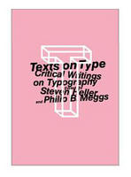
Both of these are from the text: Texts on Typography…, By Heller and Meggs

I look forward to reading your posts! If you have any questions, feel free to email me at brauert@nku.edu